In 2015, doctors in London used patient data to anticipate avoidable asthma attacks—and not just by crunching numbers.
They created a tale. A narrative about how some neighborhoods had more emergency visits, how weather and pollution patterns correlated with these increases, and how preventive interventions could reduce hospital admissions. What was the result? A citywide program that shifted healthcare response techniques. That is the art—and impact—of data storytelling.
We live in a world flooded with data. Every click, swipe, and transaction produces numbers. Despite this plethora of data, many businesses still fail to put ideas into action. This is where data storytelling comes in.
Data storytelling is the art of combining information, images, and narrative to create a coherent narrative that informs, engages, and influences. It turns analytics into action plans, dashboards into tools for decision-making, and spreadsheets into meaningful messages.
Why is this important, then? Because people remember stories rather than facts. And those who can use their data to convey a story have the ability to lead and persuade in fields like business, research, and healthcare.
This post will explain what data storytelling is, break down its essential elements, and examine how it’s applied in the real world to improve decision-making and leave a lasting impression.
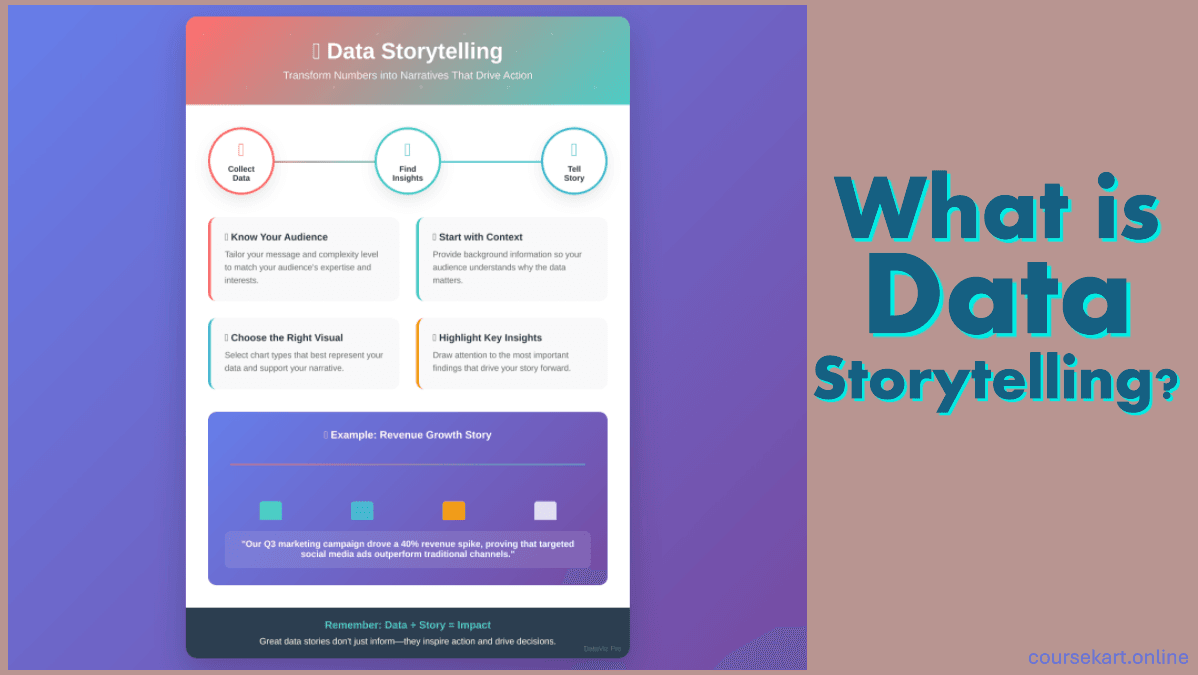
What is Data Storytelling?
Data storytelling is essentially the process of turning intricate data analytics into narratives that are understandable, captivating, and useful. It’s the art and science of taking unprocessed data and transforming it into a narrative that people can comprehend, identify with, and act upon.
Data storytelling is much more than just charts and graphs, despite the fact that it may sound similar to data visualization. In order to communicate information and give it meaning, it combines three essential components: data, story, and graphics.
Why It’s More Than Just Visualization
It’s simple to confuse effective data visualization with data storytelling. After all, attention can be drawn to a visually appealing dashboard or an animated display. However, in the absence of a compelling story, even the most exquisite images may leave viewers wondering, “So what?”
Relevance, emotion, and context are added through storytelling. It describes the significance of the data, the choices that must be made, and how those choices can lead to change. It’s the difference between demonstrating that sales fell in the second quarter and describing how a new region’s subpar customer experience caused the drop and what can be done to address it.
Making the data speak is what data storytelling is all about, not embellishing it.
Core Components of Data Storytelling
Three crucial elements must work together harmoniously for data storytelling to be successful:
1. Data: The Basis of Factual Knowledge
The narrative starts with precise, pertinent, and thoroughly examined data. This is your proof, the core of your argument. The caliber and reliability of the supporting data determine how strong your story will be. The information must be reliable and accurate, regardless of whether it concerns financial trends, customer behavior, or operational measures.
2. Narrative: The Human Bond
What makes the statistics come to life is the narrative. Data points are connected into a coherent message by the emotional and logical thread. With the aid of narratives, your audience can recognize trends, comprehend ramifications, and relate to the story on a personal level. It transforms insight into a journey by providing answers to the “why” and “what next?”
3. Visualization: Its Impact and Clarity
Lastly, images serve as amplifiers. Infographics, interactive dashboards, charts, and graphs all aid in condensing complex data into formats that are simple to understand. When done correctly, visualizing improves memory and comprehension. It makes sure your audience doesn’t get lost in the numbers and highlights important points.
Why Data Storytelling Matters
Organizations gather enormous volumes of data in today’s data-rich environment, but data by itself doesn’t add value. The ability to convey information in a way that informs, convinces, and motivates action is what really makes an impression. Data storytelling becomes essential at that point.
1. Bridging the Gap Between Data Experts and Decision-Makers
A large number of stakeholders and company executives lack data analysis training. They think in terms of objectives, tactics, and results rather than SQL queries or regression models. Data storytelling helps close the communication gap between people who need to act on the data and those who crunch the statistics by translating technical analysis into understandable language.
Data storytelling ensures that insights are not lost in translation by offering context and a narrative framework. Without requiring a degree in data science, it enables decision-makers to comprehend what’s going on and why it matters.
2. Increasing Engagement with Complex Data
Let’s be honest: spreadsheets and dashboards don’t thrill most people. Raw data can be dense, dry, and simple to ignore. However, even the most complicated datasets can draw interest and encourage interaction when they are presented in an engaging way and backed up with understandable graphics.
Data is humanized through storytelling. It transforms abstract concepts into relatable tales that people can identify with by introducing stakes, difficulties, and solutions. Data becomes easier to understand and more memorable as a result.
3. Driving Better, Faster Decisions
The ultimate objective of data analysis is to assist in decision-making. However, information buried in a report or a table seldom motivates action or urgency. By shedding light on the narrative behind the numbers, data storytelling turns insights into useful information.
Leaders are more likely to react strategically and decisively when they comprehend both the what and the why. Uncertainty is transformed into clarity and information overload into targeted action by data storytelling.
Real-World Example: How Airbnb Uses Data Storytelling
One of the best examples of a business that has mastered data storytelling is Airbnb. The organization didn’t only give out reports when it intended to maximize host performance and visitor happiness. Rather, they created interactive dashboards that illustrated trends in occupancy, evaluations, and reaction time, telling the tale of a host’s performance.
These dashboards contained stories in addition to numbers. They demonstrated to hosts why their ratings were declining, how they might raise them, and how doing so would help their bottom line. Thousands of hosts, therefore, implemented data-driven adjustments that enhanced platform expansion and client experience.
Key Concepts Related to Data Storytelling
It’s critical to examine some of the fundamental ideas that influence the creation and presentation of tales in order to completely appreciate the potential and strength of data storytelling. Although narrative, statistics, and images serve as the cornerstone, how you combine and modify these components makes all the difference. Let’s dissect some crucial differences and methods.
1. Data Visualization vs. Data Storytelling
Although it’s easy to mix up data storytelling with data visualization, they’re not the same thing.
The technique of graphically portraying data—using dashboards, maps, graphs, and charts to highlight trends or patterns—is known as data visualization. It’s a tool, a means of increasing the accessibility of data.
Conversely, the tactic is Data Storytelling. In addition to using graphics, it also provides context and narrative to lead the viewer to a powerful realization.
Consider it this way: if data is the raw material, then storytelling is the script that directs the entire experience, and visualization is the lens. Although a graph may indicate that sales fell in April, a narrative explains the reasons behind the decline, its implications, and what needs to happen next.
In short, data visualization shows, data storytelling explains and persuades.
2. Narrative Techniques in Data Communication
Whether they are presented in presentations, movies, or novels, great stories adhere to a set of rules. The same is true for data stories. A few story components that give data life are as follows:
Arc: A data tale should have a beginning (context), middle (conflict), and end (resolution), just like a work of fiction. This aids in organizing the insight both emotionally and cognitively.
Context: Establish the scene. What makes this info significant? What is the history?
Conflict or Surprise: Draw attention to a strain, issue, or surprising finding in the information. This attracts interest and creates a need for action.
Summary: What do we discover? What needs to be altered? In light of this story, what should the audience do?
You can turn unfiltered ideas into journeys that the audience can follow and find compelling by employing these storytelling approaches.
3. Audience-Centered Communication
If it isn’t audience-specific, even the strongest data story will be a failure. Knowing your audience is one of the most important aspects of effective data storytelling.
More thorough methodology, metrics, or statistical rigor may be required for technical stakeholders (such as data scientists or engineers).
You should concentrate on commercial implications, straightforward language, and clear graphics for non-technical stakeholders (such as executives, marketers, or customers).
The most effective storytellers modify the message’s structure, tone, and depth according to the audience. This entails posing queries such as:
- What does my audience care about?
- What decisions are they trying to make?
- How much background do they already have?
Effective data storytelling is always audience-first. It’s not just about what you say—it’s about what they hear, understand, and remember.
Elements of Effective Data Storytelling

Making a narrative out of data involves more than just assembling charts and comments; it involves developing a story that engages, elucidates, and persuades. Whether you’re selling to executives, reporting to a client, or engaging a broader audience, the following aspects are critical to guarantee your data story lands with impact.
1. Clarity: Keep It Simple and Focused
Data can be disorganized. It shouldn’t be your tale.
Clarity entails removing superfluous details and focusing on the most important information. Don’t overburden your audience with technical language, tangents, or measurements. A compelling story is one that is well-focused.
Make sure that every section of the story flows logically into the next, use simple language, and select just the most pertinent images. Make sure the main point you wish to convey is the only thing your audience recalls.
Tip: Each text, presentation, or image should respond to the query, “What’s the point?”
2. Relevance: Tailor the Story to the Audience’s Goals
Every captivating data story is unique to its audience. Your narrative should fit the priorities, language, and decision-making style of the people you are speaking to, whether they are frontline employees, senior leadership, or a marketing team.
A product manager might be more interested in user behavior or feature uptake, whereas a CFO would be more interested in how a trend impacts revenue. Adjust your examples, suggestions, and framing as necessary.
Tip: Build the story around the topic your audience is attempting to answer.
3. Emotion: Add a Human Element to the Data
We prefer to think of statistics as objective, but humans use emotion just as much as logic when making decisions. Your story gains depth and resonance when you include emotion.
This is not an excuse for being too dramatic. It entails relating the data to actual people, issues, or possibilities. Display the impact of a decision on a community, showcase the experience of a user segment, or demonstrate how a trend impacts consumers.
Tip: To make statistics more approachable and human, include personas, quotations, or little tales.
4. Context: Make the Numbers Meaningful
Without context, numbers are just noise. The “why” and “so what” are explained by effective data storytelling.
Give your audience enough context so they can comprehend the meaning of the data, its source, and how it stacks up against previous results or benchmarks. This promotes clarity and trust.
For instance, just stating that “conversion dropped to 3.1%” has little meaning. However, stating that “Conversion decreased from 5% to 3.1% following the redesign of the landing page” conveys a far more significant narrative.
Tip: Always base your conclusions on historical context, analogies, or causes.
5. Call to Action: Inspire Decision or Reflection
A great data story inspires people to take action, but a fantastic story motivates people. Always conclude with a clear conclusion or next action. How should this story affect the actions, thoughts, or emotions of your audience?
This could be a choice, a change in approach, a modification to the product, or just a greater understanding of an issue. A strong call to action completes the data story and guarantees that it is transformative as well as instructive.
Tip: Make the activity clear, doable, and in line with the authority or duty of the audience.
Tools and Platforms for Data Storytelling
Using the appropriate tools is just as important as having strong narrative skills when it comes to using data to create engaging stories. Contemporary technologies are made to assist storytellers in converting unstructured data into captivating experiences, from interactive dashboards to sophisticated visualizations.
Here are a few of the most widely used tools for data storytellers today, along with an explanation of how they help the craft.
1. Tableau

Ideal for Executive reports, interactive dashboards, and extensive data research.
When it comes to creating dashboards and interactive data visualization, Tableau is a formidable tool. Its capacity to enable users to lead their audience through data step-by-step, emphasizing important discoveries and permitting real-time exploration, makes it perfect for storytelling.
Features for telling stories
- “Story” tabs that blend dashboards and text.
- Interactive filters for exploration driven by the audience.
- Annotations and underlining are used to draw attention.
For instance, a nonprofit organization may use Tableau to illustrate how various factors, such as location or income, affect outcomes in different districts.
2. Microsoft Power BI

Ideal for Microsoft tool integration, KPI dashboards, and business reporting.
Power BI is well-liked by businesses that depend significantly on the Microsoft environment. With an emphasis on corporate information and decision-making, it offers strong data visualization.
Features of Data Storytelling
- Simple interface with Teams and Excel.
- Drill-down features for examining more intricate details.
- Data notifications and personalized graphics.
For instance, a marketing manager may create a Power BI report that displays campaign ROI by location, which would help the sales team identify patterns and better allocate resources.
3. Flourish

Ideal for Interactive, animated, and personalized visual narratives.
Rich, editorial-style visualizations are what make Flourish unique; they are ideal for journalists, content producers, and anybody else wishing to share a data story with the public. Its templates are quite adaptable and frequently don’t require any knowledge of code.
Features for telling stories include
- Scrolly formats and animated charts.
- Simple embedding for presentations and web content.
- Smooth cooperation and export possibilities.
For instance, a news organization may utilize Flourish to build an interactive timeline with narration and comments that link particular data points to climate change events.
4. Datawrapper

Best suited for Publishing charts that are responsive, tidy, and fast.
Datawrapper is well-known for being elegant and simple. For making charts and maps that are simple to create and distribute, media organizations choose it.
Qualities of Data Storytelling
- Stunning defaults for clear visual results.
- Simple data entry using copy and paste.
- Mobile and web-responsive graphics.
Datawrapper can be used, for instance, by a financial blogger to illustrate market patterns and mark downturns and upswings in a way that makes the story easy to follow on any platform.
Common Mistakes in Data Storytelling
Without careful crafting, even the best-laid plans for data stories might fail or worse. Learning narrative methods is vital, but so is avoiding common errors. The most common errors that compromise the integrity and impact of data storytelling are listed below, along with advice on how to avoid them.
1. Overloading with Visuals
It is not necessary to construct a dozen graphs simply because you can. Your audience may become overwhelmed or confused by too many or too complicated pictures, particularly if they are not experienced with data interpretation.
Charts should be illuminating, not distracting. Even though a busy PowerPoint with five different kinds of graphs could look impressive, you’ve lost your audience if they can’t understand the purpose right away.
Instead, For each insight, use one powerful visualization. Keep it concise, targeted, and supported by a succinct, understandable explanation.
2. Ignoring the Audience
Even the most insightful analysis is useless if it doesn’t connect with the audience. A serious error is to not adapt your tale to the demands, background, or decision-making role of your audience.
A CEO might find what delights a data analyst boring. A developer could be perplexed by what a customer success manager finds engaging. Rarely does a one-size-fits-all narrative work.
Instead, Ask Yourself – For whom is this narrative intended? What is important to them? What am I hoping they will do?
3. Misrepresenting or Cherry-Picking Data
Biased or twisted narratives destroy trust more quickly than anything else. Cherry-picking positive information or disregarding context, whether on purpose or by accident, can result in poor decisions and harm your reputation.
This comprises –
- Displaying just the timelines that bolster your findings.
- Disregarding anomalies that alter the story.
- Skewing perception by using deceptive axes or graphic kinds.
Instead, Give context and transparency first priority. Present the whole picture, be aware of your limitations, and always give credit to the sources of your material.
4. Lacking a Clear Narrative or Conclusion
The charts are with you. You have the information. Your message will fail, though, if there is no plot—no clear path that leads your audience from realization to action.
Too many data presentations lack a common theme and instead veer from one statistic to another. Others just conclude by saying, “Here’s the data,” without providing a clear conclusion or suggestion.
Instead, Give your story a beginning (setup), middle (conflict/insight), and end (action/resolution). Make your main point clear and instruct your audience on what to do next.
Data storytelling is about clarity, relevance, and trust, not just figures or pictures. By avoiding these typical blunders, you can make sure that your story not only informs but also motivates appropriate action.
When done correctly, your story becomes a catalyst for change rather than just a report.
Real-World Examples of Data Storytelling
Although data storytelling is an idea, it is best grasped by application. Data stories are being used by organizations in a variety of fields, including marketing, public health, and climate research, to engage with a wide range of audiences, promote action, and simplify complicated issues. Let’s examine three potent instances that demonstrate the potential influence of data storytelling.
Example 1: Public Health Dashboard – COVID-19 Trends
Public health agencies worldwide confronted a pressing dilemma during the peak of the COVID-19 pandemic: how to convey rapidly evolving data in a fashion that the general public could comprehend and act upon.
The remedy: For data storytelling, interactive dashboards like the one created by Johns Hopkins University became essential tools. They presented changing narratives of infection waves, hospital burden, vaccine rollouts, and recovery rather than merely displaying case data.
Components of storytelling
- Clarity: Simple, interactive graphics helped regular people understand complex facts.
- Context: People’s understanding of dangers was aided by comparisons across time and geographical areas.
- Call to Action: The information affected safety practices, travel choices, and policy.
Why it worked: These dashboards demonstrated how skillfully written data stories can raise public awareness and influence behavior by using real-time data, clear images, and targeted narratives to provide life-saving information to a worldwide audience.
Example 2: Marketing Campaign Performance Report
An e-commerce company and a digital marketing firm sought to demonstrate the benefits of a multi-channel campaign that comprised influencer collaborations, sponsored advertisements, and email promos.
The team used Power BI to create a narrative-based performance report rather than displaying raw stats like click-through rates and conversion counts.
Components of storytelling
- Relevance: Business objectives like return on ad spend (ROAS) and customer acquisition cost (CAC) were closely linked to metrics.
- Emotion: The narrative was interwoven with quotes and testimonials from recent clients.
- Call to Action: The article ended with data-supported suggestions for growing profitable channels.
The reason it worked was that executives, who were not marketing specialists, realized the impact of their investment very fast and knew exactly what to do next to increase success. The report convinced in addition to informing.
Example 3: Climate Change Impact Visualizations
Despite the well-known density of climate change data, some groups are transforming the research into visually compelling narratives that evoke strong emotions.
NASA’s Climate Time Machine, which employs animated data to illustrate the changes in global temperatures, sea levels, and Arctic ice across several decades, is a notable example.
Components of storytelling
- Visualization: Time-lapse videos clearly depict glaciers melting or CO2 levels rising.
- Emotion and Context: Human accounts and predictions on the long-term effects are interwoven with the gradual, insidious changes.
- Call to Action: The website provides links to policy information, sustainable projects, and instructional materials.
Why it was successful: In addition to explaining climate statistics, these visualizations provide consumers with a sense of the problem’s urgency. They transform abstract knowledge into a visual, communal experience that is difficult to overlook.
Data storytelling is not restricted to any particular field, as demonstrated by these real-world examples. Regardless of the field—public health, business, or the environment—storytelling transforms facts into a tool for action, empathy, and awareness.
Future of Data Storytelling
The art and science of data storytelling are more important than ever as the amount and complexity of data continue to increase at an exponential rate. Exciting advancements in the future are anticipated to transform our comprehension, communication, and response to data insights.
1. The Growing Importance of Storytelling in AI and Big Data
Every second, enormous volumes of data are produced by Big Data and Artificial Intelligence (AI) technology. But without a compelling story, mere data is overwhelming and frequently incomprehensible.
Key applications of data storytelling include
- Enabling human decision-makers to access AI-driven insights.
- Converting intricate algorithms and forecasting models into understandable, useful narratives.
- Supplying context and transparency to help organizations accept and trust AI advice.
Stated differently, storytelling serves as a link between complex data science and practical decision-making.
2. Role of Data Literacy in Organizations
As data becomes a primary asset, data literacy—the capacity to understand, comprehend, and explain data—becomes an essential talent at all levels of a company.
Future-ready firms will invest in developing data storytelling abilities across teams, enabling employees to ask smarter questions, create interesting narratives using data, and collaborate successfully with technical specialists and business leaders.
This cultural shift toward data literacy guarantees that stories are shared and understood by all stakeholders rather than just specialists.
3. Emerging Trends in Data Storytelling
Interactive Dashboards: As real-time, highly interactive dashboards become more popular, viewers will be able to go deeper into the data at their own pace and explore stories in real-time.
Personalized Storytelling: Data processing advances will enable storytelling systems to customize narratives to the roles, preferences, and decision-making settings of specific users, increasing the relevance and impact of data stories.
Narrative AI: New AI-powered technologies will help automatically create stories from intricate datasets, allowing human storytellers to concentrate on originality and clever framing while maintaining precision and consistency.
Final Thoughts
Data storytelling is a potent technique that turns unstructured data into compelling, unforgettable stories; it’s not just a trendy buzzword. The capacity to effectively and persuasively convey findings closes the gap between analysis and action in today’s data-driven society.
Data storytelling enables decision-makers to comprehend complex information and make more informed decisions by fusing clarity, relevance, emotion, context, and a compelling call to action. Data-driven narratives have the power to influence people’s opinions and have practical effects on everything from public health emergencies to advertising campaigns and climate change.
If there’s one lesson to be learned, it’s that while data by itself can inform, data storytelling can motivate. Adopting data storytelling will improve your capacity to persuade, engage, and lead with assurance, regardless of your level of experience as an analyst.
Thus, begin practicing right now. Carefully craft your narratives, keep your audience in the forefront, and see how your data comes to life in unexpected ways.
FAQ
What exactly is data storytelling?
Data storytelling is the process of integrating data, images, and context to transform data analysis into understandable, captivating, and actionable narratives. It assists in making difficult information interesting and comprehensible for a range of audiences.
How is data storytelling different from data visualization?
Making charts and graphs to visually depict data is the main goal of data visualization. On the other side, data storytelling creates a compelling story that inspires insight and action by fusing these images with a narrative and context.
Why is data storytelling important for businesses?
By making findings understandable and useful, data storytelling helps close the gap between decision-makers and data professionals. It facilitates teams’ ability to recognize opportunities, comprehend patterns, and make well-informed decisions more quickly.
What skills are needed to become a good data storyteller?
Data literacy, the capacity to tell compelling tales, knowledge of best practices for visualization, and the ability to adapt stories for different audiences are all essential. Critical thinking and communication are also crucial.
Can data storytelling be automated?
While AI and tools can help by producing draft narratives and charts, human creativity is still needed for good data storytelling in order to provide audience-resonant context, emotion, and strategic framing.
What are some common mistakes to avoid in data storytelling?
Frequently made mistakes include cherry-picking data, neglecting the demands of the audience, overloading with images, and not having a clear narrative or call to action. The audience may be misinformed or confused by these mistakes.
What tools can I use to improve my data storytelling?
Popular tools include Datawrapper for fast, clear charts, Flourish for animated visual stories, and Tableau and Power BI for interactive dashboards. Your objectives, target audience, and level of technical familiarity all influence the decision.
Share Now
Related Articles
Data Quality Explained – What It Is And Why You Should Care
Should You Learn Python Or R For Data Science?
Top 10 Online Data Science Courses For Beginners
The Importance of Data Cleaning and How to Do It Effectively?
Discover more from coursekart.online
Subscribe to get the latest posts sent to your email.